Welcome to the Sungrow iSolarCloud app, your gateway to understanding and optimising your solar system’s performance. In this comprehensive guide, we’ll walk you through the fundamental steps of interpreting your solar data, or you can watch the videos below.
Introduction
before you begin, it might be worth reminding yourself of the difference between energy capacity (kw) and energy output (kWh).
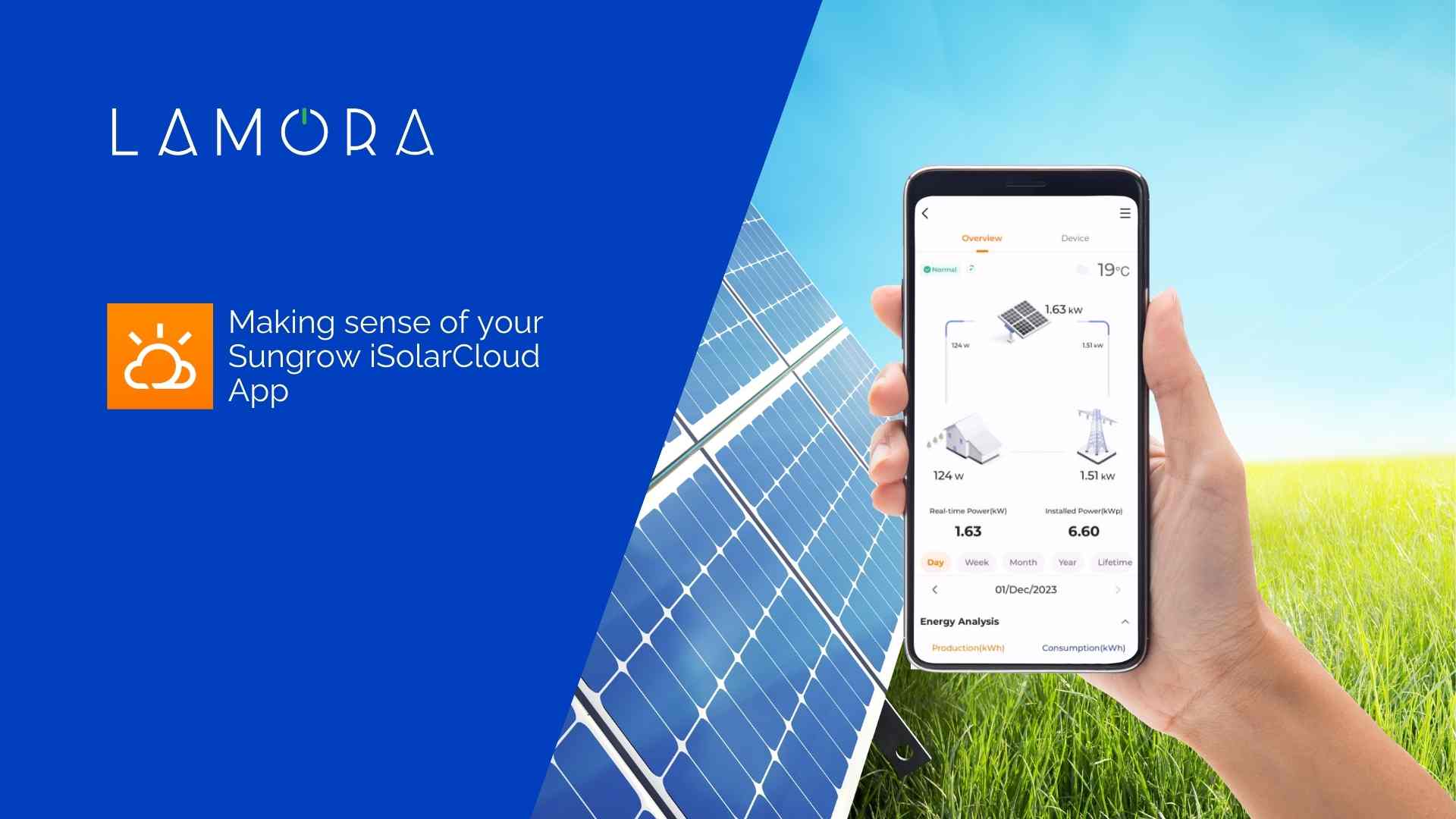
Upon opening the app, you’ll be greeted by a screen presenting vital information about your solar ecosystem. Let’s delve into the key components:
- Top Image (Solar): This represents your solar system, and the number is the current energy output from your solar panels, known as PV.
- Bottom Left Image (Home): This represents your home, and the number is the amount of energy your home is presently using, known as your load.
- Bottom Right Image (Grid): This represents the grid and reflects either the energy pulled from the grid or the energy fed into it.
The lines between these images illustrate the direction of energy flow.
Daily Energy Analysis
Scrolling down, you’ll encounter the Daily Energy Analysis section:
- PV: Displays the energy your system produces.
- Grid: Shows a positive or negative value based on whether you’re drawing from or feeding into the grid.
- Load: Represents your overall energy demand.
Weekly Overview
Switching to the weekly view provides a summary of the last seven days:
- PV Bar: Above the line indicates generation and below represents consumption.
- Grid Bar: Above signifies energy purchased and below indicates energy fed back.
- Load Bar: Reflects your daily energy demand.
Production Data
Further down, find a section dedicated solely to production data:
- Peaks: Represent good sunny days.
- Troughs: Indicate cloudy or rainy days.
Consumption Data
Move even further down to explore consumption data:
- Self-Sufficiency Bar: Reveals the portion of energy sourced from your solar system.
- Grid Consumption Bar: Illustrates the amount of energy drawn from the grid.
Earnings Estimate
Towards the bottom, discover an estimate of your earnings:
- Note: Actual earnings will be calculated by your energy provider using meter readings.
- Day-by-Day Estimate: Offers insights into energy savings and costs.
Setting Feed-in and Consumption Rates
If you need to set your rates, go to the menu, click on your plant configuration, and select Tariff.
Select the edit icon in the top right corner to set your rates.
- Feed-in Tariff: The rate your energy provider pays you for energy fed back into the grid.
- Consumption Tariff: The amount your energy provider charges you for energy drawn from the grid.
Conclusion
Thank you for joining us on this iSolarCloud app walkthrough. We trust that you found this guide helpful. For more solar-related information, visit our website.


